Hi there!
It’s Kan from Exploratory.
Last week, I wrote a blog post about the dramatic increase of mothers who are addicted to opioids during pregnancy in the United States, and found that some states like Vermont, West Virginia, etc. have seen about 97 times and 53 times increases between 2000 and 2014. It was a horrible trend to visualize.
One reader, who wrote an article about the opioid epidemic after interviewing dozens of people in those states for a Japanese news magazine, suggested me that the increase in some of the states can be explained by Coal Mining operations, the hard back-killing nature of work and the decline of the employment. So I quickly visualized the impact of the coal mining employments in some of the states with the data about the employemnt of the coal mining operations. The result is shocking at least to me. If you’re interested in, take a look at this post I have put together for more details.
Anyway, here’s this week’s update!
What We Are Reading
The Power User Curve: The best way to understand your most engaged users - Link
Understanding the engagement of users is critical if you are building a product or service and want to grow. Typically, a metric called ‘engagement rate’, which calculates as DAU (Daily Active Users) / MAU (Monthly Active Users), was made famous by Facebook and has been used by many startups. But it might not work well for some type of products like B2B SaaS or productivity products. This is when the Power User Curve analysis comes in rescue. We use it here at Exploratory as well, and I’d recommend you try it, too, if you happen to have such products or services.
Tim Hwang’s FiscalNote is revolutionizing Washington lobbying with big data - Link
I’m always excited to see ‘old industry’ gets revolutionized by Data and AI. And this is another story, but this time it is about the notorious lobbying industry in the United States.
Optimizing BigQuery: Cluster your tables - Link
Great tips if you use Google BigQuery.
Quote of the Week
“Sometimes, what you’re looking for is already there.”
by Aretha Franklin
R.I.P. …
What We Are Writing
Here are some blog posts I have written last week.
An Introduction to Line Chart in Exploratory - Link
There are a lot you can do with Chart in Exploratory. I have summarized some of them in this post by using Line Chart as an example.
How Coal Mining Employment Has Impacted on Opioid Epidemic in America - Link
As mentioned at the beginning, I have visualized the coal mining employment data in order to see the correlation between the coal mining employment and the opioid epidemic in America. In this post, you can also find some useful data wrangling techniques in the second half of the post.
- Remove Empty Rows
- Convert from Wide to Long Data - Gather / Unpivot
- Extract Numeric Data and Convert to Numeric Data Type
- Convert State Code to State Name
How to Calculate Percentile for Each Group - Link How to Calculate Percentile Ranks in Exploratory - Link
These two sounds similar, but slightly different. 😎
What We Are Working On
Exploratory v5.0
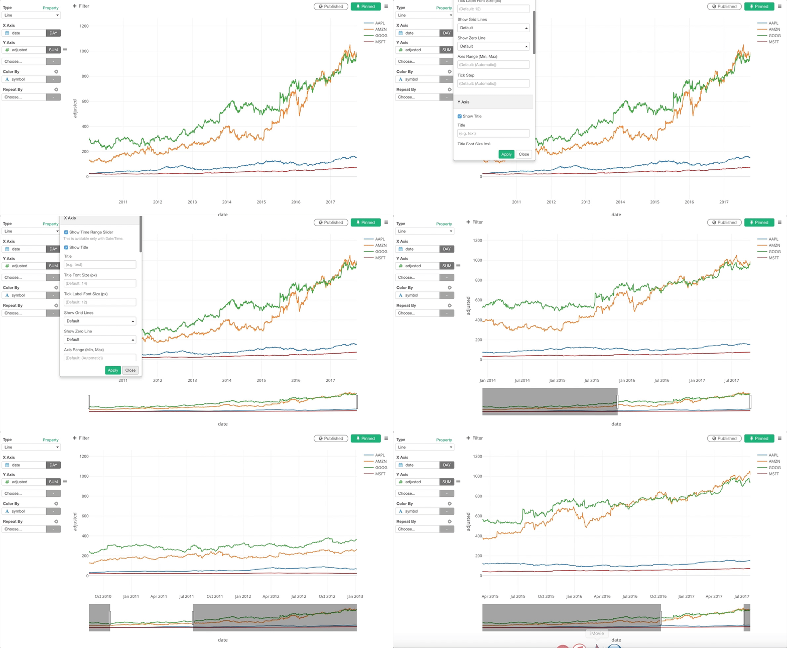
Not just adding new chart types, we are also enhancing the existing chart features. One of them is to support the time range slider for Line chart when a date/time column is assigned to X-Axis.

Exploratory 4.4.0.5 Patch
I mentioned this last week, but I’ll mention this again. :)
If you’re a Dashboard / Note / Slides user I’d strongly suggest you download and upgrade. There are a few critical bug fixes.
The upgrade is very simple, here is “how to upgrade” guide.
Take a look at the release note for more details about the patch.
That’s it for this week.
Have a wonderful week!
Kan CEO/Exploratory
This is a weekly email update of what I have seen in Data Science / AI and thought were interesting, plus what Team Exploratory is working on.